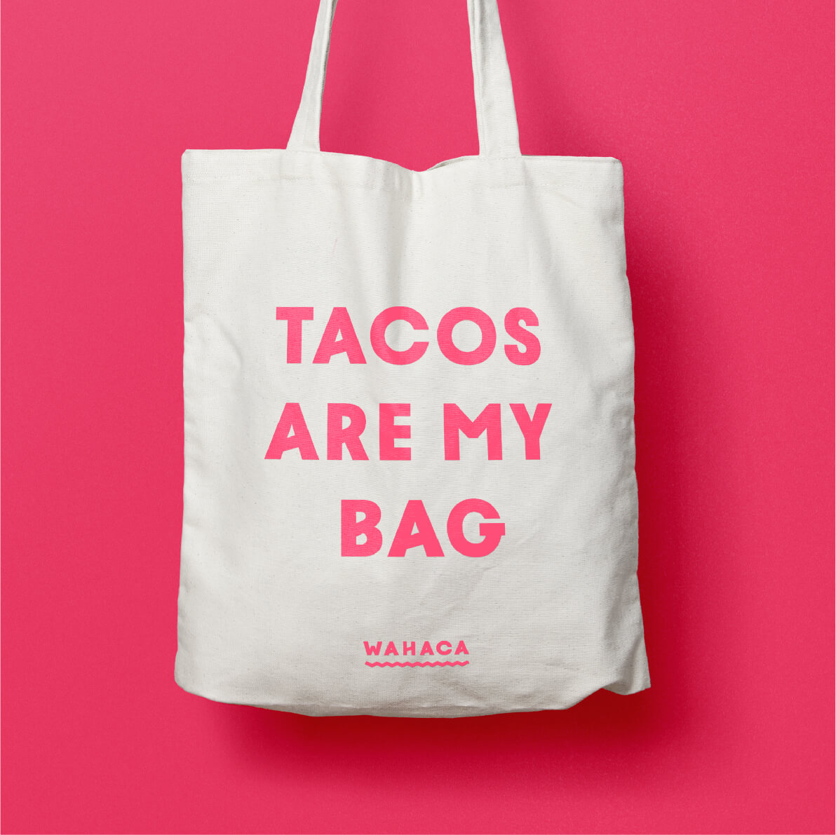
Wahaca brand development
Since creating the original identity in 2007, Without® have helped Wahaca become one of London’s most successful and best-loved restaurant groups. Ten years on, taking real Mexican food to the rest of the UK posed challenges: the need for scalability; ubiquity of the ‘streetfood’ aesthetic they helped create; the need to move beyond an occasional ethnic treat. Wahaca needed to simplify.
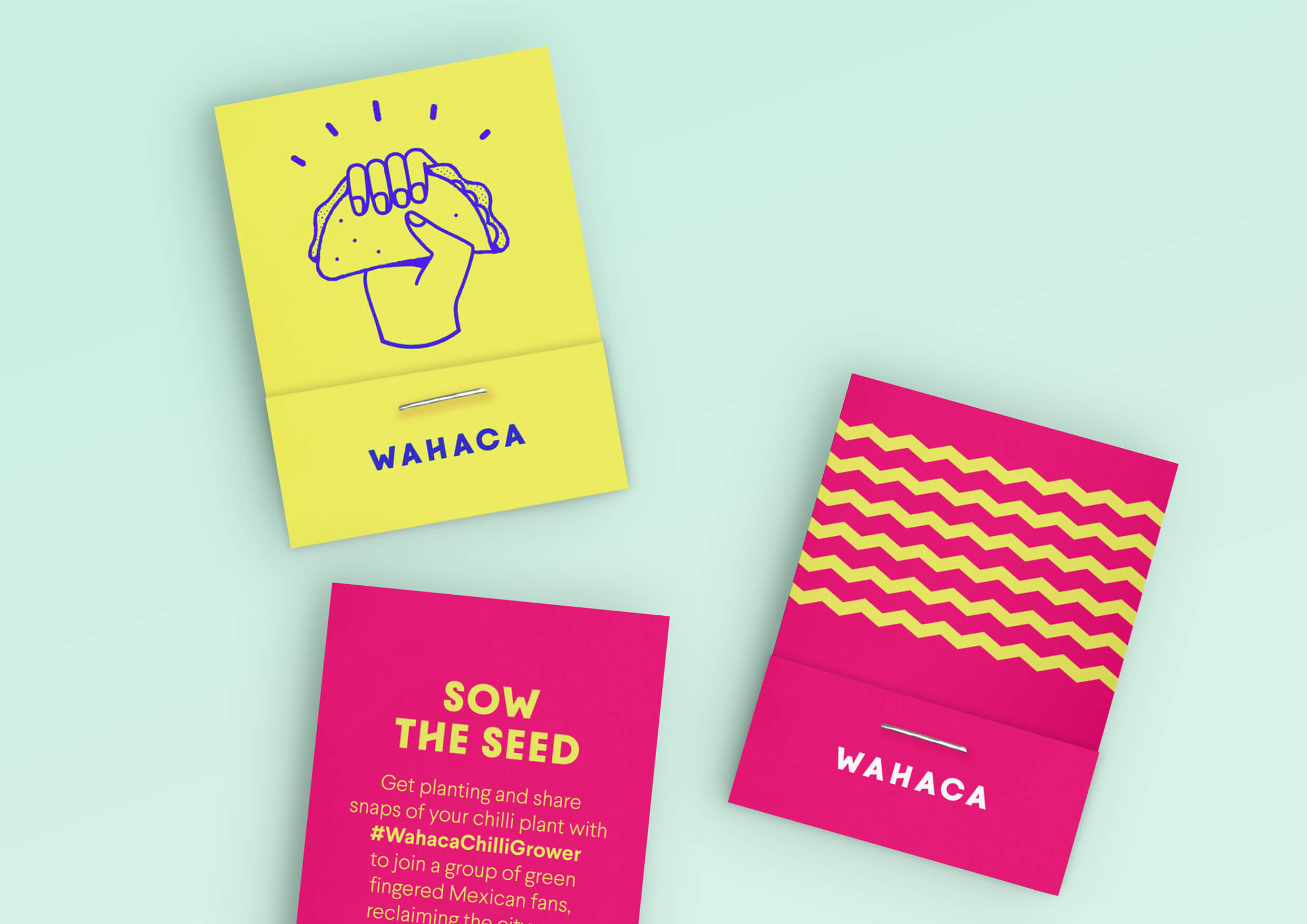
Let’s go for tacos
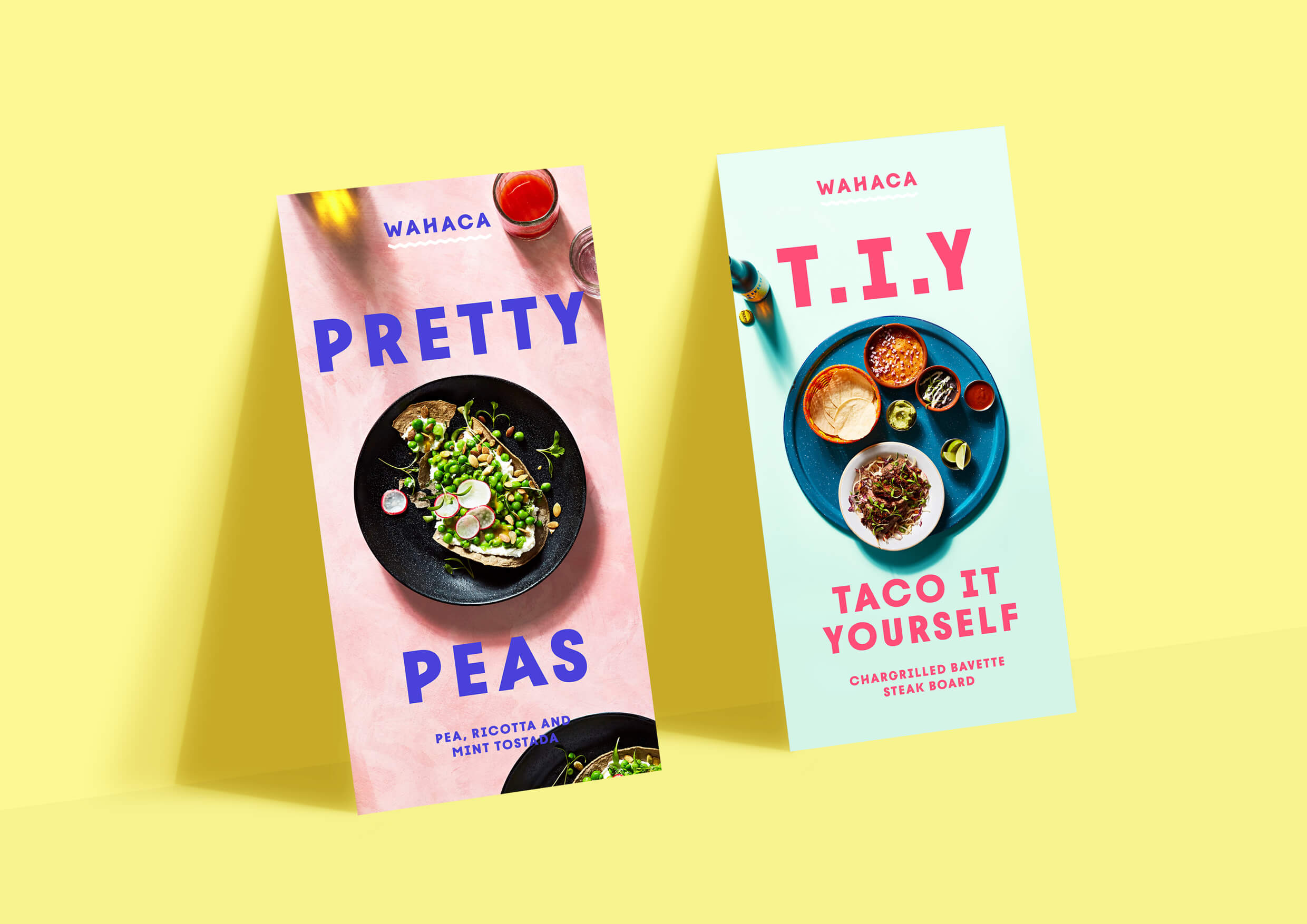
Wahaca don’t dumb it down. Once people are sat down, this means an inspiring flavour trip. From the outside, however, their offer is more complex than ‘burger’ or ‘pizza’. This, coupled with the trend towards format over ethnicity (and research showed that instead of saying “let’s have Mexican”, people were saying “let’s have a Wahaca”) led us to champion the taco.
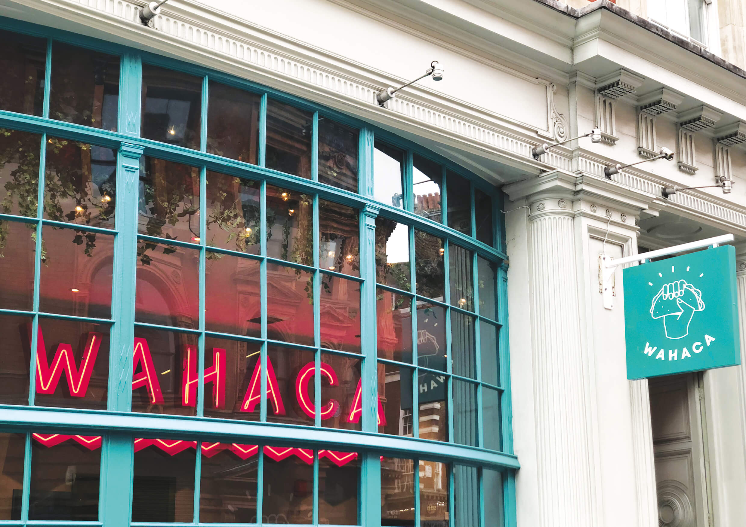
Wahaca’s new logo is hard-working: establishing a signature dish, reflecting the company’s sense of mission and, simply, being bold.
Less ‘markets’, more ‘sunshine’.
To get customers all over the UK interested on Tuesday lunchtimes rather than just special occasions, Wahaca needed to retain the spirit of the markets of Mexico without the clutter and confusion. Colours, copywriting and a signature bespoke typeface were all designed to increase accessibility. The design refocused on conveying the sense of colour, flavour and excitement that Mark and Tommi first experienced in Oaxaca. Distilling the emotion, rather than recreating a Mexican market.
Transformative design
Without worked with menu specialists 2Forks to demystify and organise Wahaca’s most important piece of communication: beautifully simple layout, food photography, links to an insta feed to help understanding, concluding with emphasis of app payment. This new design led to the highest month on month sales in Wahaca’s history.
From startup to household name
The best startup hospitality businesses are full of the energy of founders regularly physically present in site. As they grow, the brand needs to take more responsibility for ensuring everyone understands the company values. With the new identity, Wahaca have moved from a lovably chaotic world that worked brilliantly across a handful of London sites, to a robust graphic system, faithful to the original spirit, but that helps teams all over the country speak the same language.
“Back in 2007, Wahaca’s vibrant, bespoke aesthetic, pre-dating the streetfood boom, redefined Mexican food in London. But 10 years is a long time in a competitive market. To help them grow further, they needed to reaffirm their credentials with scalable branding: simpler and more defined.”
Roly Grant, Co-founder and Creative Director of Without®