How do you translate your brand into a physical space? Let us count the ways…
“Little has been done to the space since the new owners arrived,” Jay Rayner wrote in the Observer last month about a new London restaurant taking over the site of a former steakhouse. “What drives me nuts is that significant amounts of money have been spent here on branding and sloganising; on creating the idea of a cool restaurant. But just saying stuff doesn’t make it so.”
Rayner’s comments are really an attack on slogans (not branding) that say one thing (“big flames”) and do another (not even the grill is lit). Words have set up an expectation that the restaurant has failed to deliver and, in hospitality, space matters. It’s a differentiator, an opportunity for customers to live the brand, with all its textures and nuance. We love to get involved: one of our senior designers is a Richard Rogers alumnus, our strategy director – with a Masters in Engineering – is never happier than when poring over a floorplan. But that’s never the starting point.
“Branding is not a plaster of slogans stuck over cracks on your walls”

Brands that struggle to translate into physical spaces often get off on the wrong foot. The key is knowing where to start…
1. START WITH YOUR STORY
Done well, a physical space can be a transportive experience. In reality, you’ll be in Covent Garden, but the vibe is Mexican markets (Wahaca) or the Irani cafés of 1900s Bombay (Dishoom).
Mike Sinclair, co-founder of interior architecture studio Macaulay Sinclair, says that, even for long-standing clients like Dishoom, every new restaurant begins with a narrative. “Dishoom might give us a poem or a fictional story, like they did for the new Canary Wharf site,” Mike tells us. “Because each bespoke designed restaurant is different – informed by the locale, the demographic, the building – a unique narrative is our starting point.”
That narrative is enriched by trips to Bombay before beginning work on a new Dishoom restaurant. “A big buzzword for us is research,” Mike says. “Our graphics, lighting, furniture, textures, palettes, details – they all come from extensive research, otherwise the interior would be soulless. And it works the other way, too. Of a new site, we always ask: what did this place used to be? How was it used? How can we reclaim some of that magic? Some nostalgia?”
2. START WITH YOUR VALUES
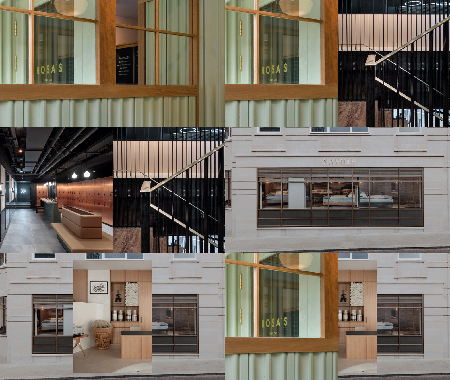
Most furniture retailers are happy to do all business online, but Savoir also values the tactile experience of a physical space to showcase its extraordinary beds – as do its customers. So when Savoir decided to open a flagship showroom in Mayfair last year, it was an opportunity to communicate its brand values of comfort, craft, heritage and bespoke quality via the space itself.
In allowing their values to light the way, Savoir introduced new textures and materials, including sand-hued concrete floors, plaster paint walls in bone, oak fitted joinery, and polished and burnished brass metalwork, which had never before been used in Savoir showrooms. The curved sweep of the stairs and the stepped plasterwork detail around the headboards make subtle reference to Savoir’s heritage and connection to The Savoy Hotel.
To complement the artistry and craft of the beds themselves, Savoir brought together photography, sculpture and artisan furniture, including a collection of handmade furniture pieces by Scottish makers Faolchú, which add warmth and patina to the space.
Whilst online sales at Savoir continue to be strong, according to managing director Alistair Hughes, “new and existing customers ultimately want a human-led personal service”.
3. START WITH YOUR FUNCTION
A new client recently described the interior of one of the group’s restaurants as a “hospitality machine”, designed as “a loop” so that the waiters move seamlessly in one direction. As a customer, you’d be admiring the Art Deco details, but unwittingly appreciating a space that is designed around function, in this case: service.
Wok to Walk’s point of difference is fire: fresh food, cooked expertly and quickly over hot flames. So our rebrand (watch this space once the project is complete) was built around the idea of “cooked by lighting”, heroing the chefs as “Woksmiths” and doubling down on the alchemy of metal and fire to create delicious and nutritious meals. Fire was such an intrinsic part of the brand that it even spawned its own avatar.
When it comes to interiors, cooking stations where chefs show their skills are prominently on display, putting the function of the restaurant at the forefront.
Dark, neutral tiles will provide a backdrop to better highlight the flames. Functional materials like concrete and metal are treated with un-finessed honesty (able to withstand the heat and knocks of constant heavy use). A neon lightscape is designed to showcase and play with the flicker of flames. Compare this to Jay Rayner’s complaint at the start of this article.
Any of the three approaches (or indeed a combination) can work. The secret is to first work out your difference. If you can articulate what you stand for, then all of this makes sense. But if not, get in touch. Good branding opens up a world of relevant inspiration, a northstar to help make creative choices. It is not a plaster of slogans stuck over cracks on your walls.