A hospitality rebrand built for growth
How do you build a hospitality brand that feels like a private members’ club yet stays open to everyone, all day?
Coppa Club asked us to resolve a tricky mix of challenges: a fuzzy brand story, spaces not yet behaving as true multi‑use environments, an expanding estate without a clear brand architecture or naming strategy, and only a sketch of who the guests really were and what moved them. It wasn’t a cosmetic brief; it was a fundamental rethink – strategy through to visual identity, voice and art direction – designed to scale.
We began by articulating a single, memorable idea to unite the business: clubhouses in beautiful locations to eat, drink, meet, work and stay – like a members’ club, without the fees. That proposition gave Coppa Club a north star, aligning teams, training and guest experience from first coffee to last cocktail. From there, we built a robust, multi‑site brand architecture with one parent brand – Coppa Club – expressed locally through site-specific identities and experiences.
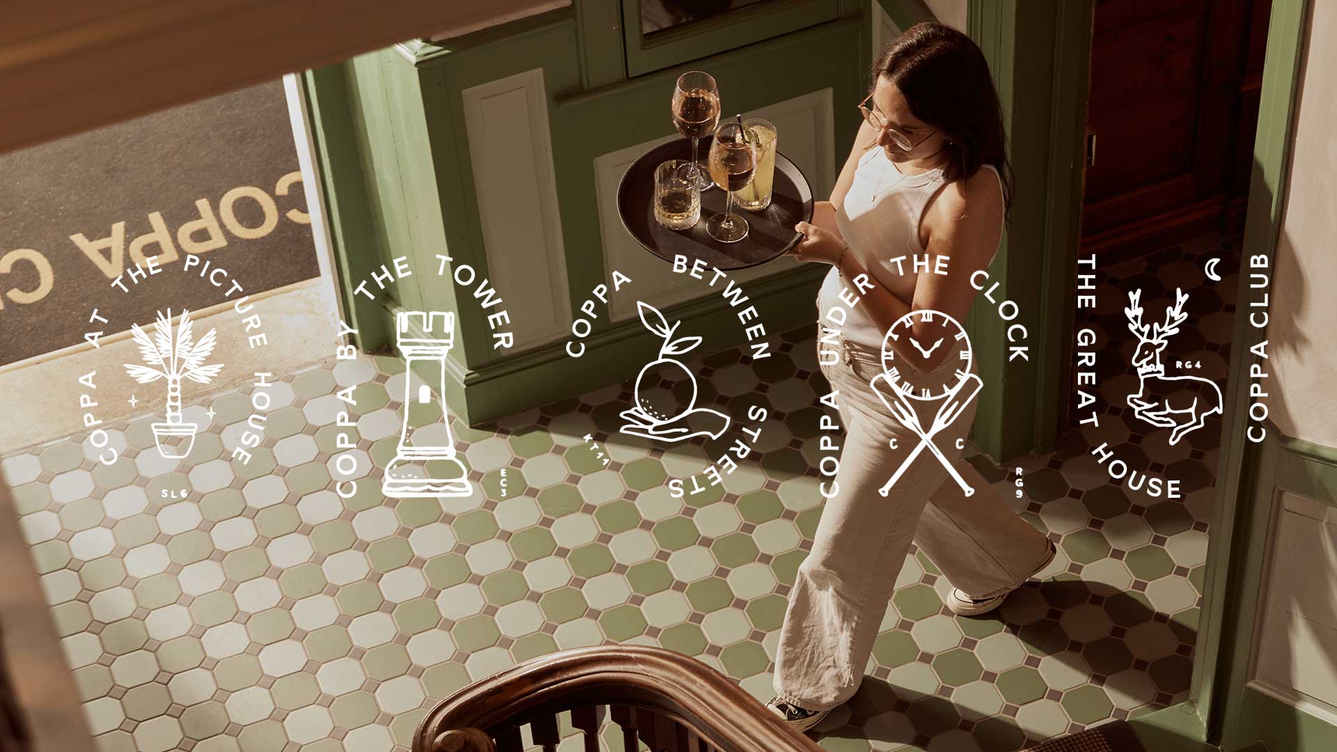
To connect the group while preserving individuality, we created an insignia system for each location. These marks function as primary on‑site signatures and pull together bespoke illustrations, postcodes and typographic cues shaped by the building and its history. The result is a set of crests that feel bespoke and collectible – an identity system guests recognise and staff are proud to wear – grounded in experiential brand design rather than one‑off logos.
What we did
Brand identity
Brand strategy & story
Copywriting
Employer branding
Interior direction
Photography
Research & insight
Website design
The visual language balances clean utility with character. A pairing of Sunset Gothic and Cambon delivers clarity and elegance across menus, signage and digital touchpoints, while a sophisticated, inviting colour palette – structured for ease of use – keeps the brand fresh without chasing trends. Crucially, we tightened the tone of voice to respect the audience’s intelligence: human, factual, edited. Instead of generic adjectives, we use emotive facts – flexible spaces, riverside terraces, indoors‑outdoors living, and a respect for local history – to paint a picture of how Coppa is different.
Art direction completes the system. We show how Coppa feels, not just what’s there: natural interactions from solo laptop mornings to lively dinners, considered lighting that’s fresh and optimistic by day and warm and intimate by night. The lens focuses on excellence without formality – Coppa as an easy escape that celebrates its neighbourhood. This is art direction that drives real‑world behaviour, ensuring the spaces are seen and used as intended: to work, meet, dine and stay.
Underpinning it all is sharper customer understanding. By clarifying personas – what motivates them and what turns them off – we refocused Coppa’s many offers into coherent journeys that encourage repeat use across dayparts. That strategic clarity is what turns a good brand into a commercial engine.
Why does it matter? Because scaling hospitality brands live or die on coherence. A singular proposition powers consistent training and guest experience. A clear, multi‑site brand architecture and place‑led naming strategy remove friction from roll‑out. A distinctive visual identity system and on‑site insignias build recognition and pride. A disciplined voice and considered photography make every touchpoint work harder, from menus to social to signage. This is a real world brand strategy designed for growth – effective on the ground, not just in guidelines.